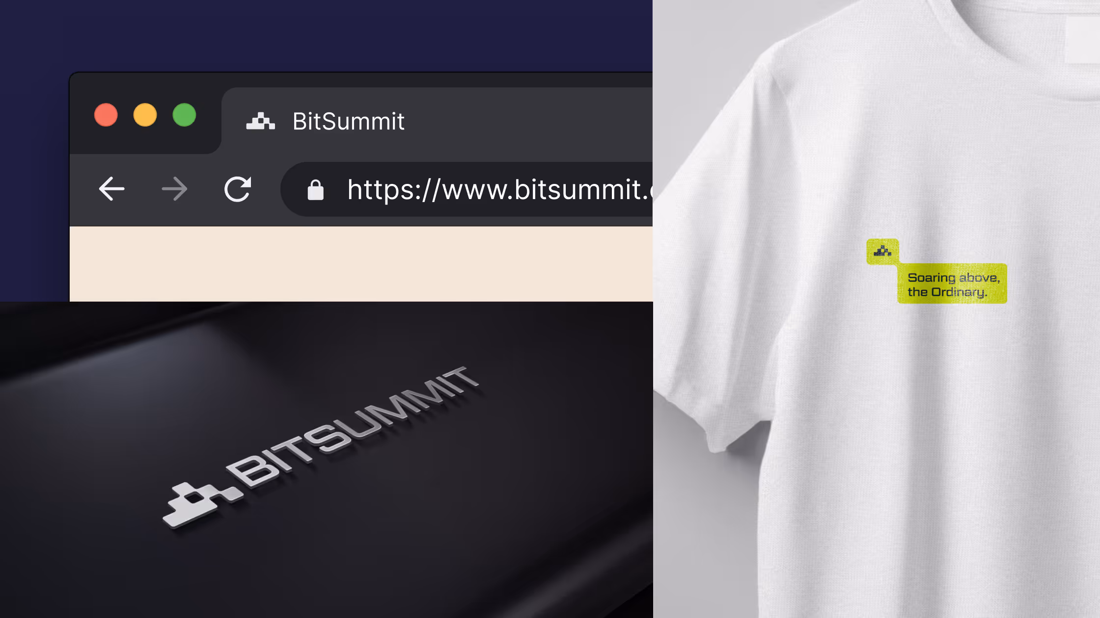
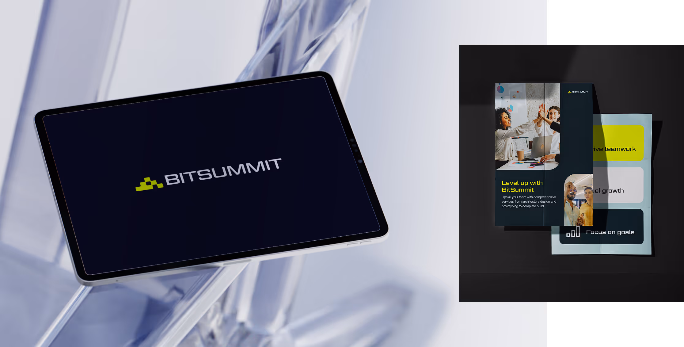
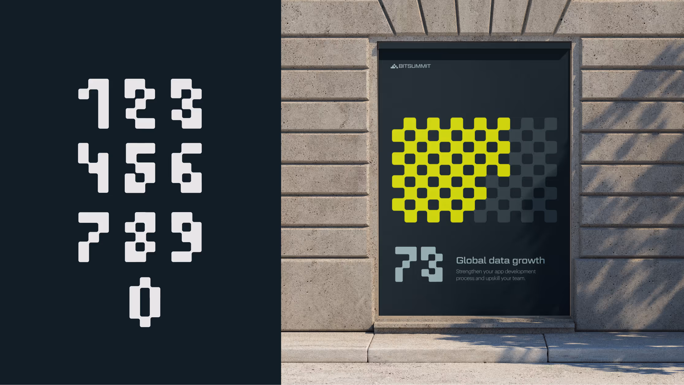
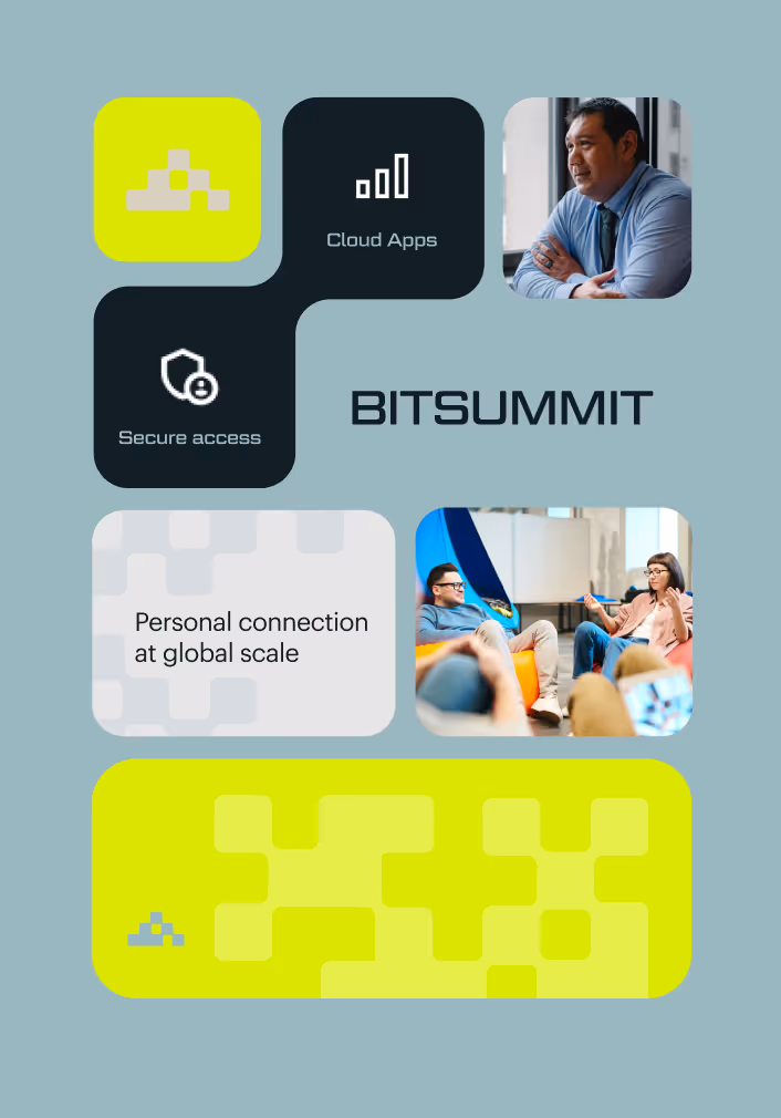
The visual language extends this modular logic across the entire brand. A bold yet refined color palette balances professionalism with energy, while clean geometric typography reinforces the brand’s modern and trustworthy tone. Interactive shapes and evolving patterns derived from the “bit” create a dynamic system that adapts across digital platforms, editorial layouts, and marketing collateral, making the identity as flexible and innovative as the company itself.
From there, the system expanded across the brand with interactive elements, numerals, and dynamic assets that carried the story of transformation forward. The result was a flexible, modern identity that positioned Bitsummit as a future-focused partner, ready to help companies innovate and thrive.
.svg)