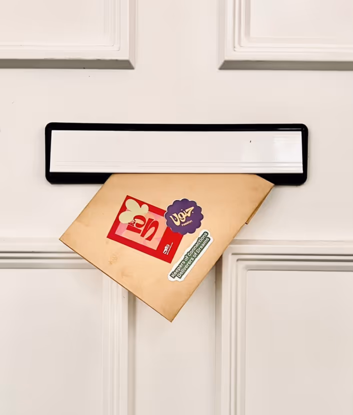
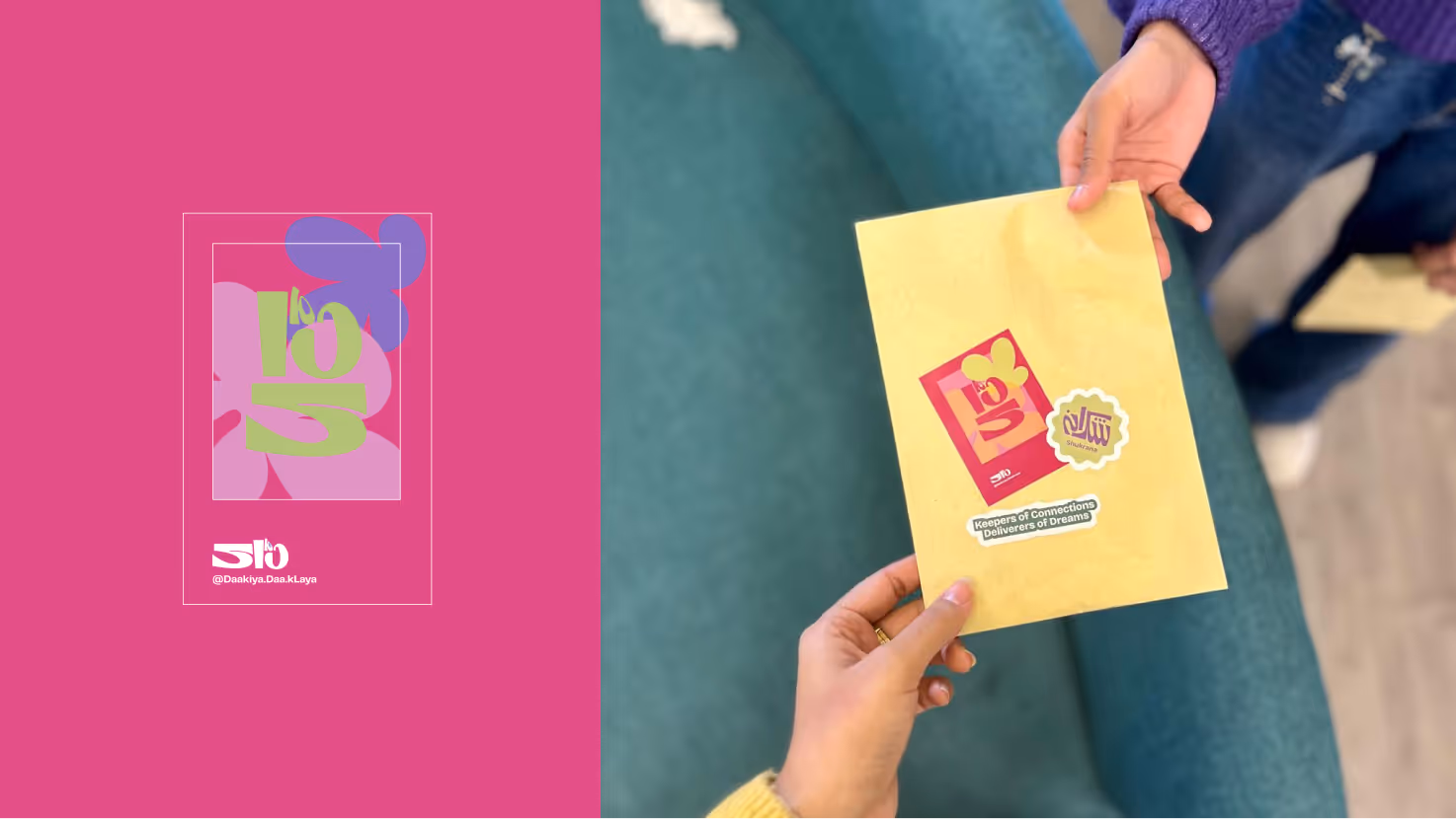
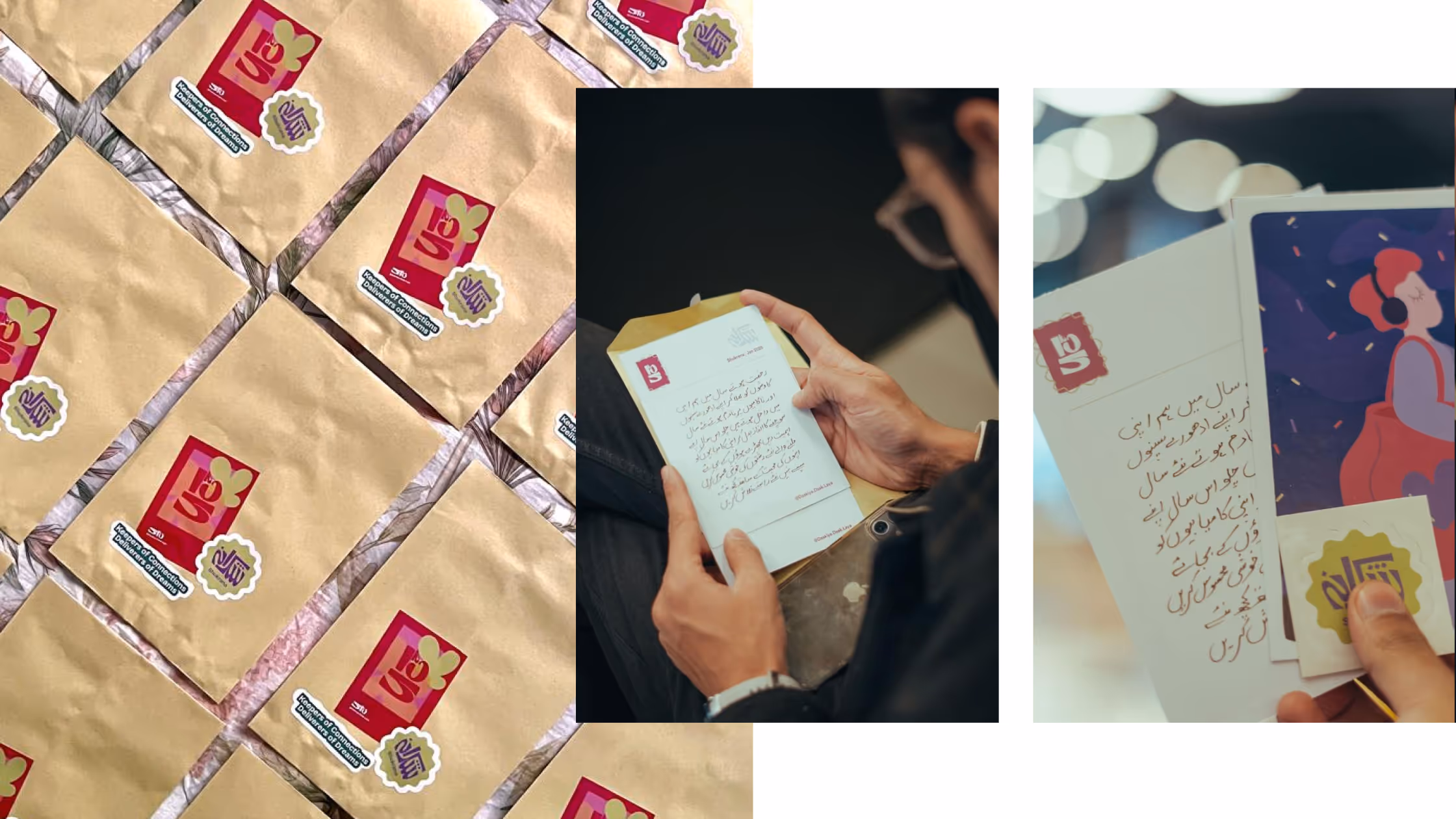
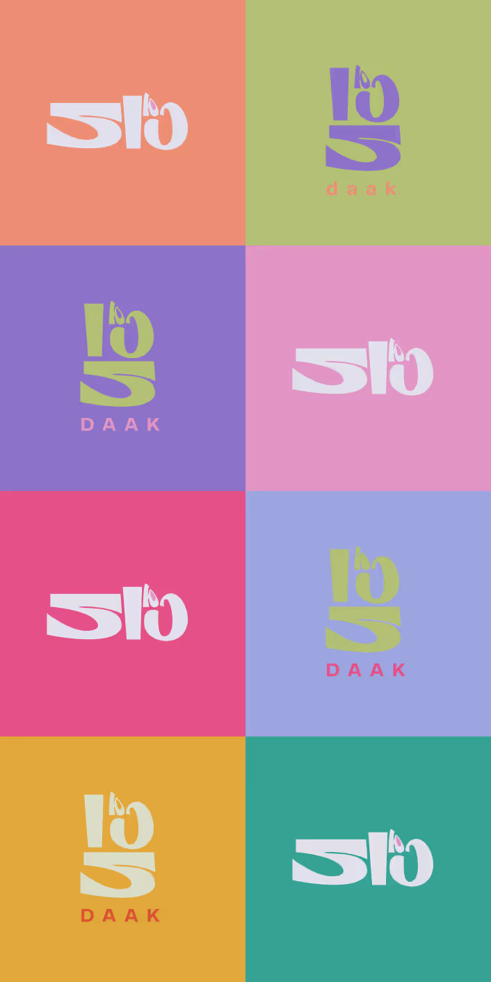
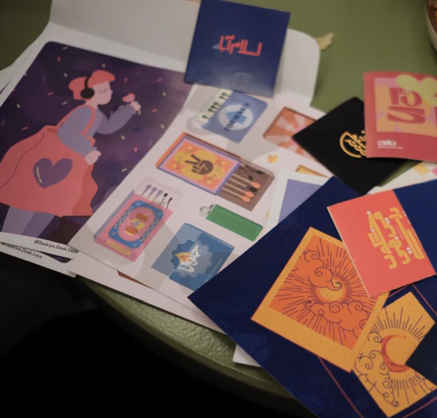
The concept of postcards naturally came tied with a bit of nostalgia. But I wanted to make it more present, why did it have to be thought through in tones of sepia and classic fonts? The concept was simple, modernising the concept of post and re-establishing the persona of a Daakiya. I knew the branding of Daak had to be imagined as modern so I created a custom typeface with cues from Brutalism. A The colors had to be bright, a desaturated palette had no place here. Fun forms. Unlikely takes on your regular concepts.
As typography was the face of the brand, I gave detailed thoughts to what we wanted to do there. The name came from Urdu, so the portrayal was naturally in Urdu, but I wanted to keep the Urdu identity hand in hand with English. The thought was to reach more people and to make it more accessible. More Functional.
.svg)